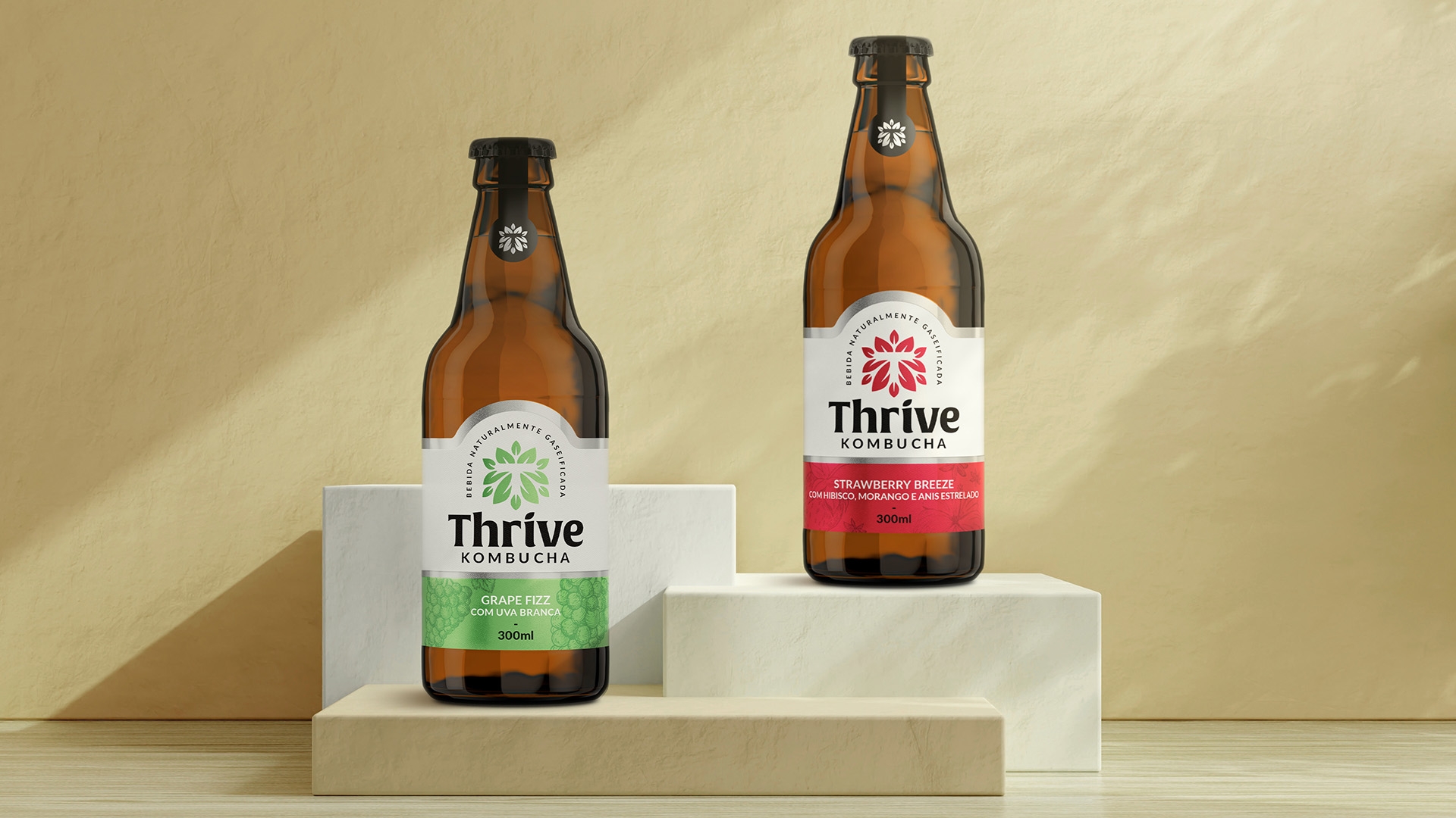

Visual identity • labels • stationary • uniform
Thrive Kombucha begins its story in Porto Alegre/RS as an artisanal kombucha brewery, offering quality products and providing health and well-being to its consumers. The company plans to offer 100% organic products to grow as an industry.
The symbol features leaves forming a circular shape with the letter "T" in negative space at the center and is a visually attractive and symbolic representation of the product. The use of leaves represents nature, health, and sustainability - important values associated with the healthy beverage industry. Additionally, the leaves reference the main raw material of Kombucha, green tea, which is known for its antioxidant and healthy properties.
The choice of the semi-serif font for the logo is a subtle reference to the shape of leaves, aiming to strike a balance between simplicity and sophistication, which helps communicate the quality and refinement of the product.



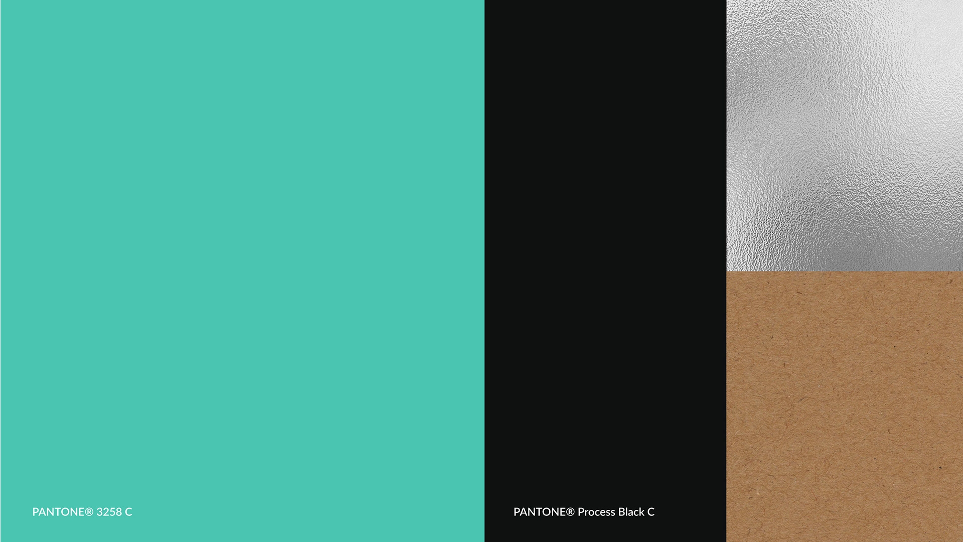
The visual identity was developed to ensure that its institutional colors, black and turquoise blue, harmoniously work with materials such as silver foil and kraft paper used in its packaging. This combination of colors and materials conveys a message of quality and sophistication while maintaining a connection with nature and sustainability, essential brand values. The visual identity will be applied to all company touchpoints, creating a consistent and memorable brand experience for consumers.


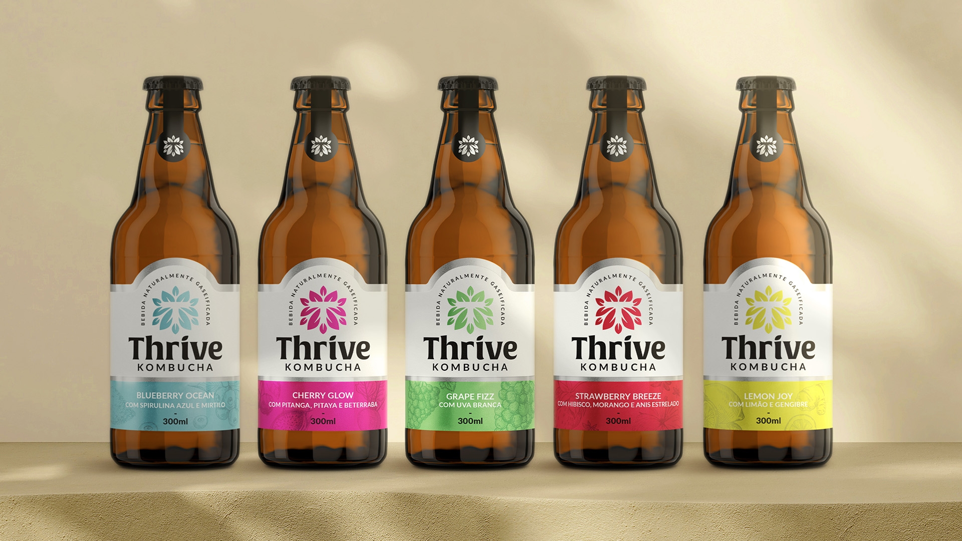
The labels of Thrive Kombucha showcase the brand prominently with a vibrant color palette that references the different flavors. With a silver foil finish, the labels convey a message of sophistication and quality, standing out in the market.
