
naming • brand identity • graphic design
Fluvitá is a company specialized in engineering services involving water, such as hydraulic projects, urban infrastructure and sanitation.
With offices in Cascavel and Curitiba, Paraná, its focus is on serving large companies and industries. In 2020, it was necessary to strengthen and professionalize the brand through a new name and visual identity. The project aimed to reach new customers, reinforcing concepts such as security and intelligence, and positioning the company as a project specialist.

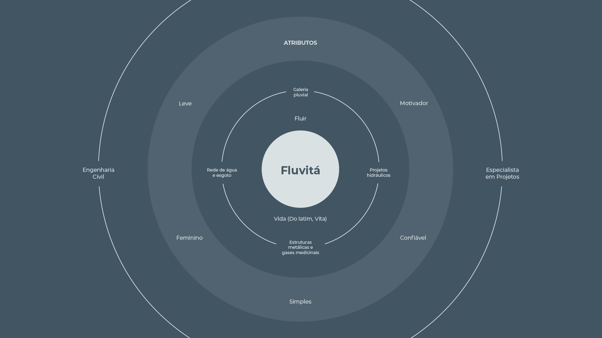
Initially the company used the name of its founder, Bruna Pereira. However, with the growth, the need arose to change its image in the market, professionalizing it. The main objective of the naming project was to reinforce the image of a specialist in projects involving water, making evident the differentiation factor in relation to generalist civil engineering offices. The name was created from the combination of the words FLUVIAL, related to river and also the word FLUIR (flow in PT-BR), a term that refers directly to liquids. Finally the word VITA, life in Latin, was added. The result was a simple, fluid and feminine sound.
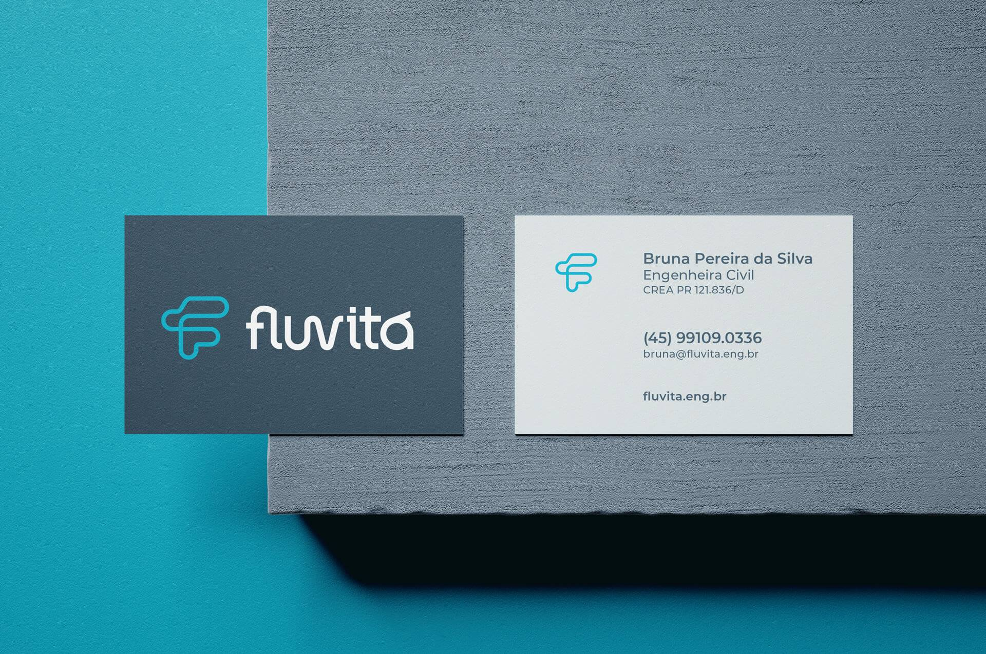
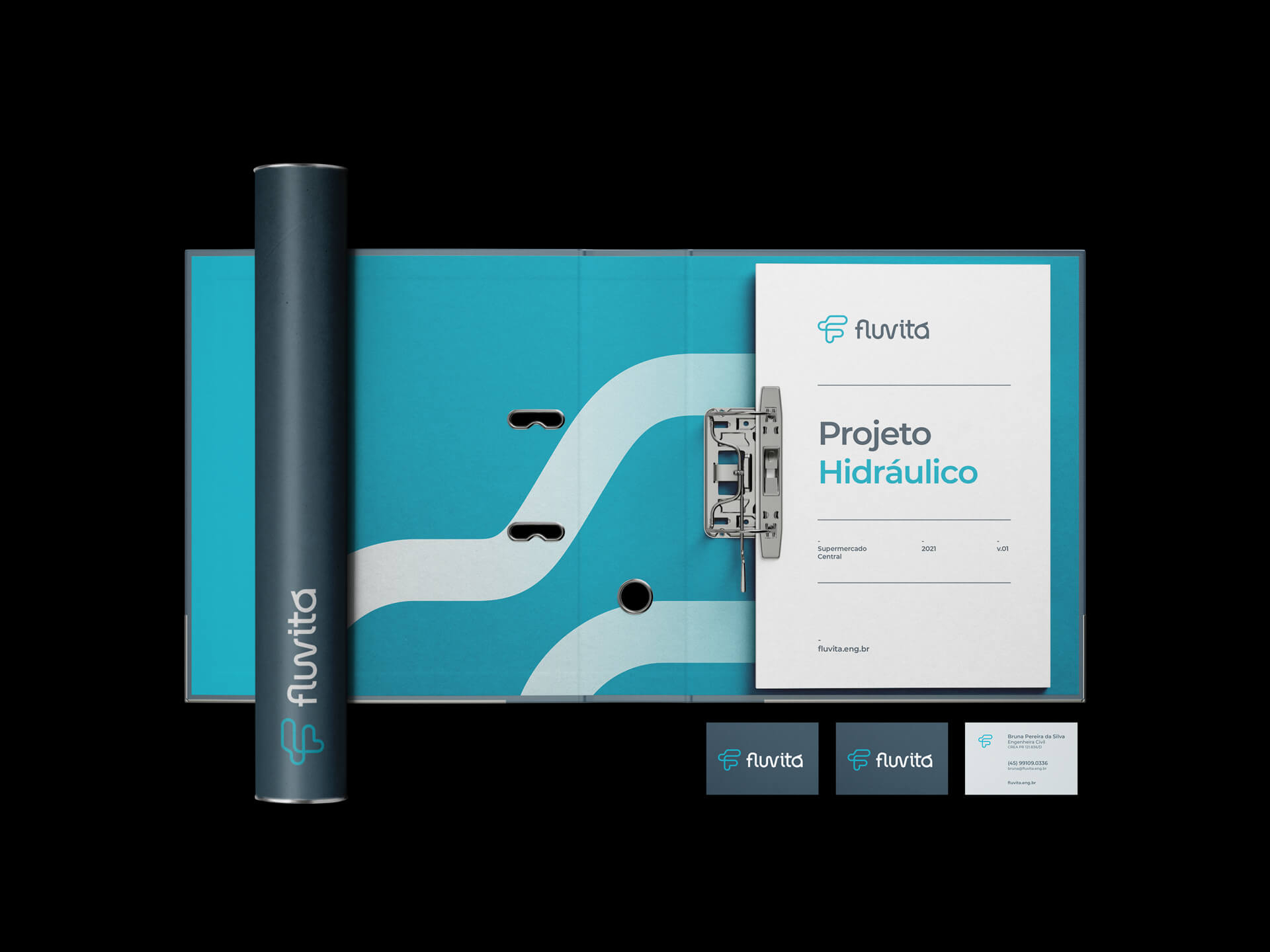
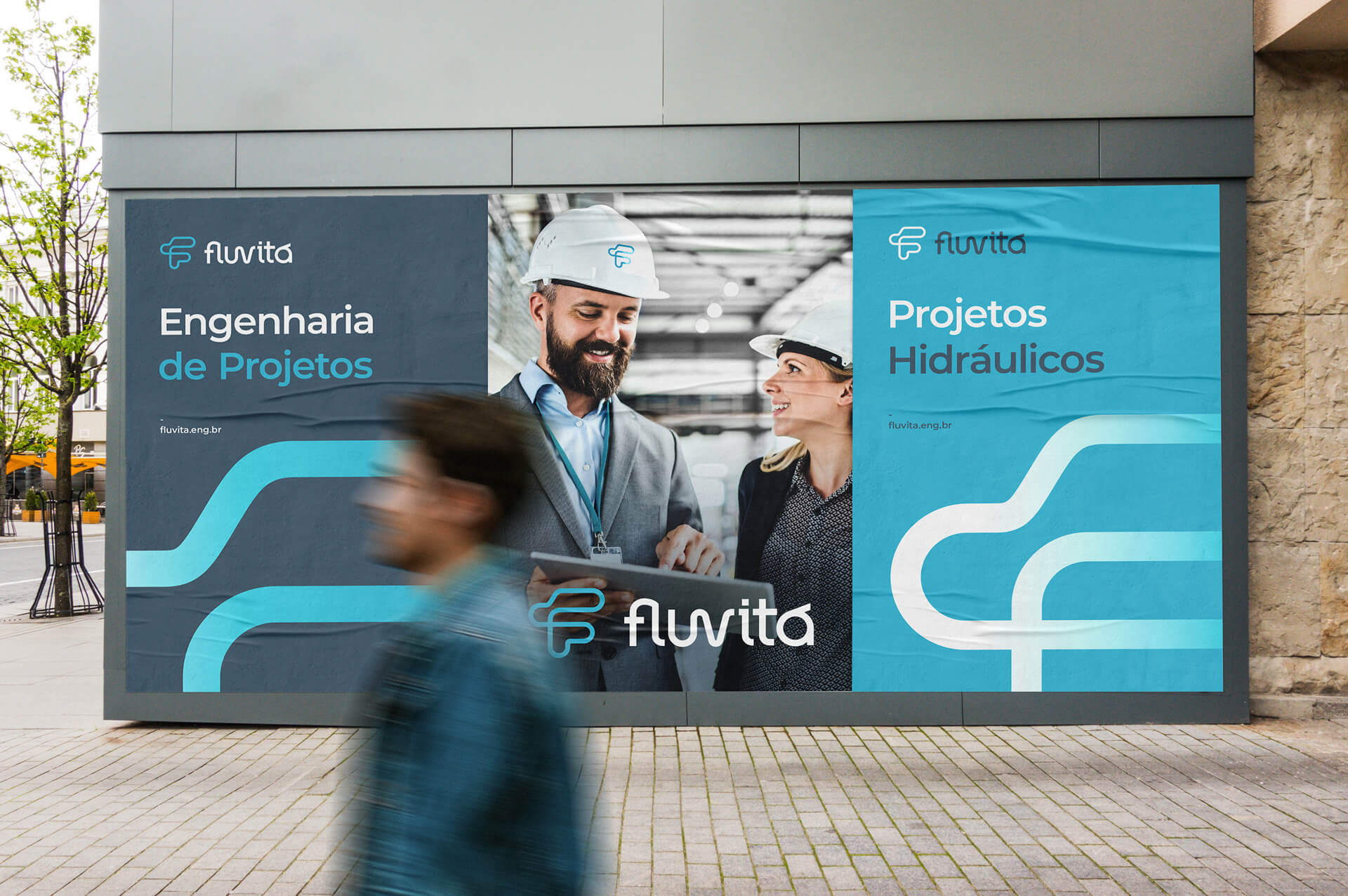
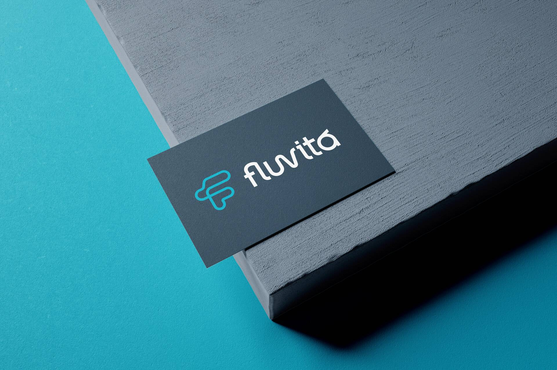
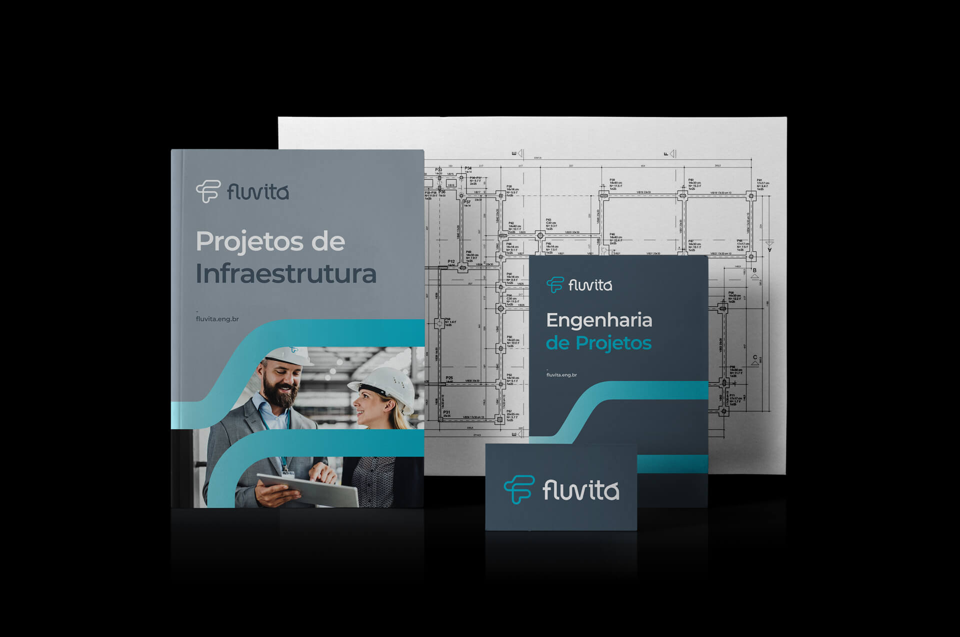
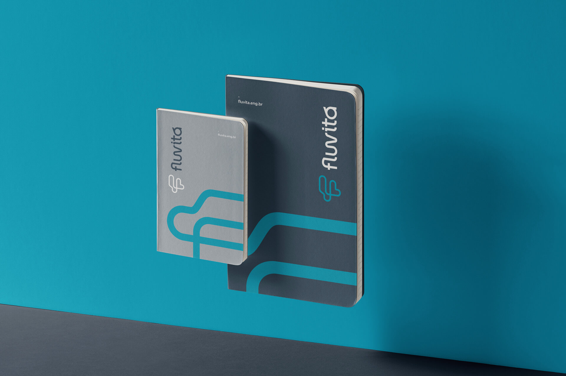
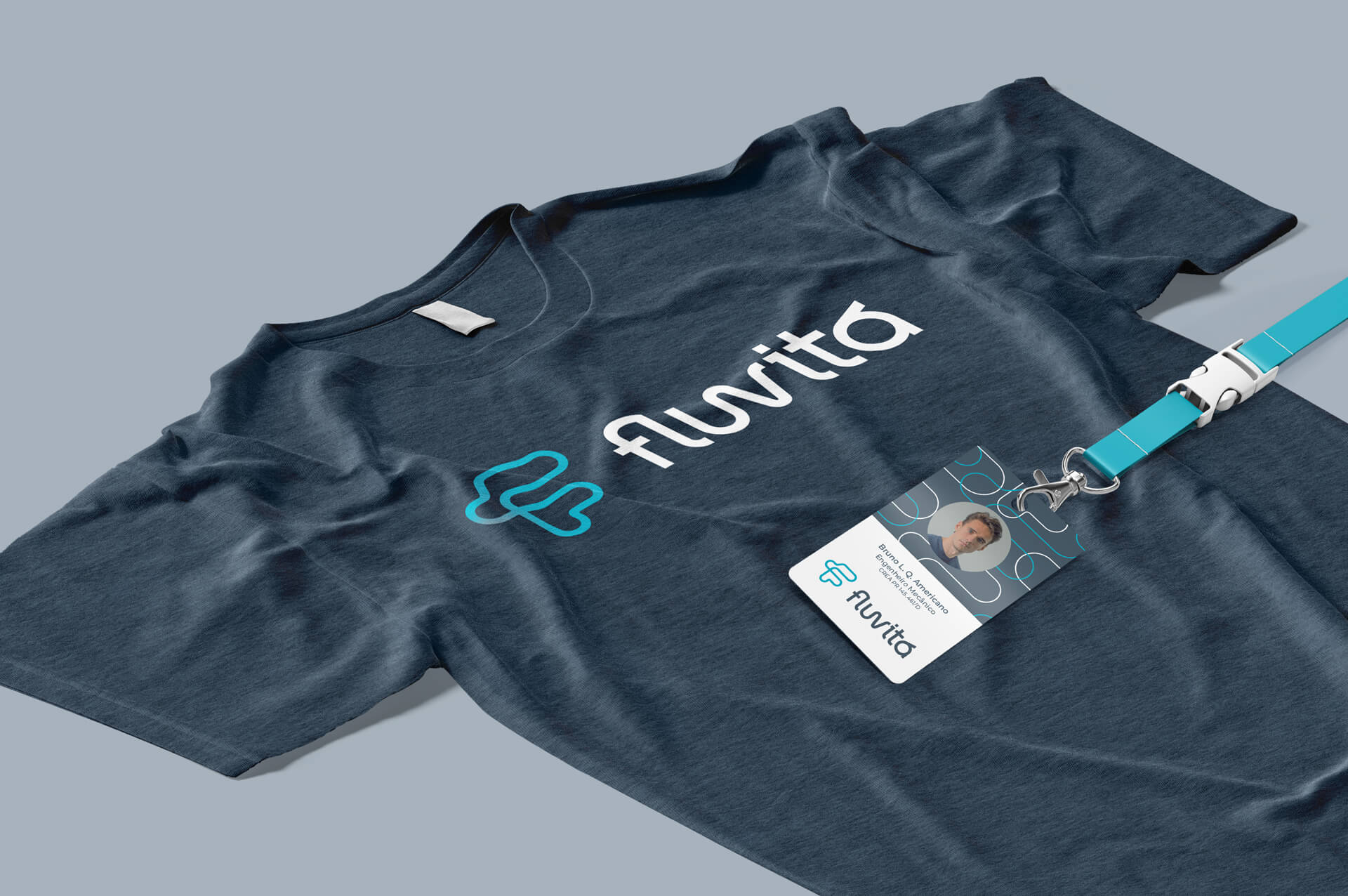
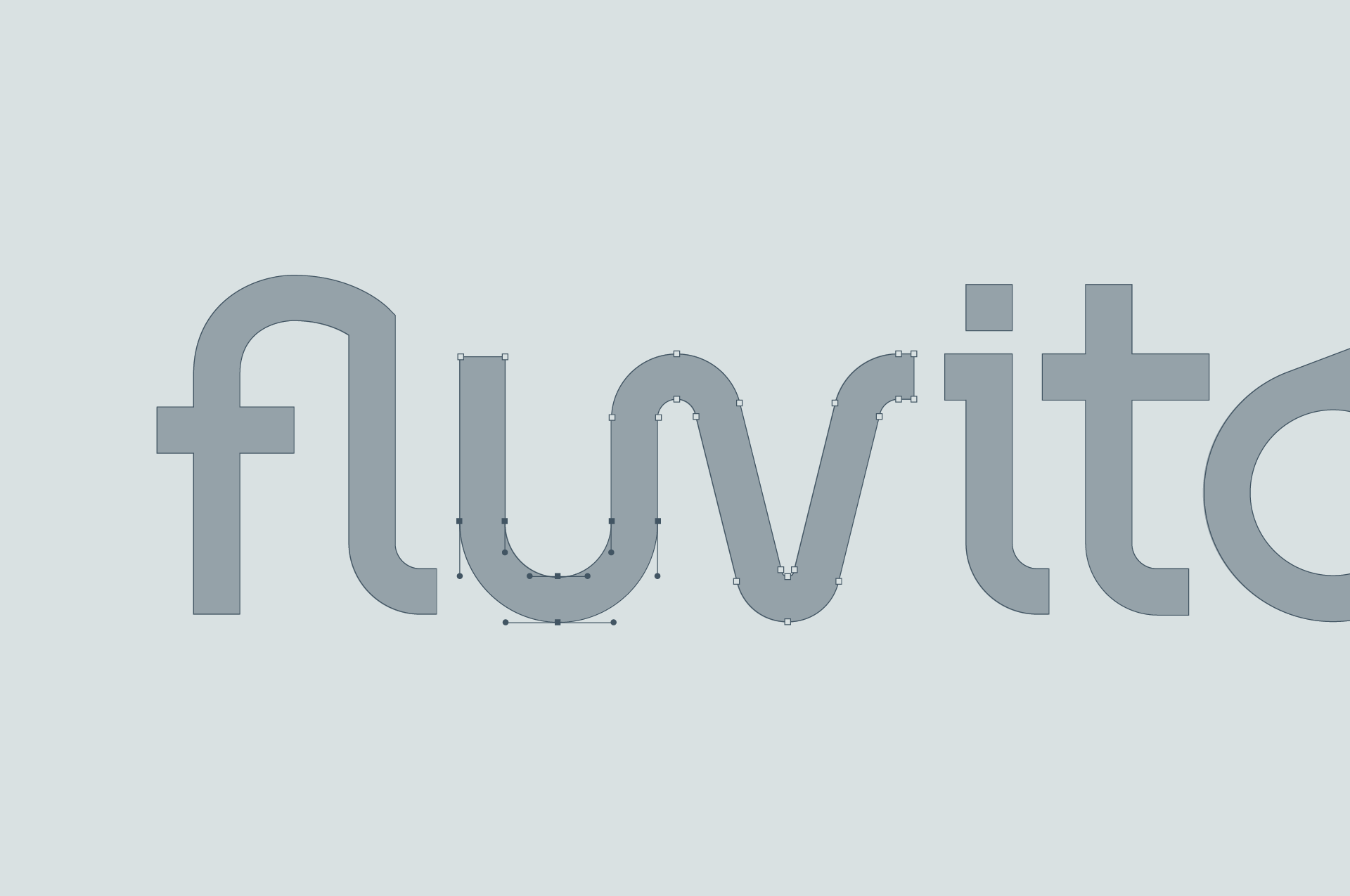
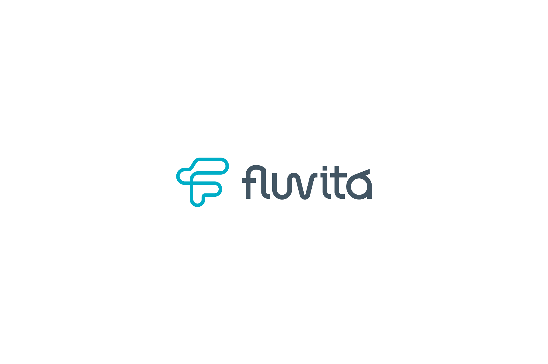
The symbology was inspired by pipes and the flow of water, forming the initial "F". The logo follows the same concept, with letters interconnecting like pipes. Associated with a color palette that uses shades of gray and blue, the visual signature further reinforces the meaning of the name and the positioning of the brand.
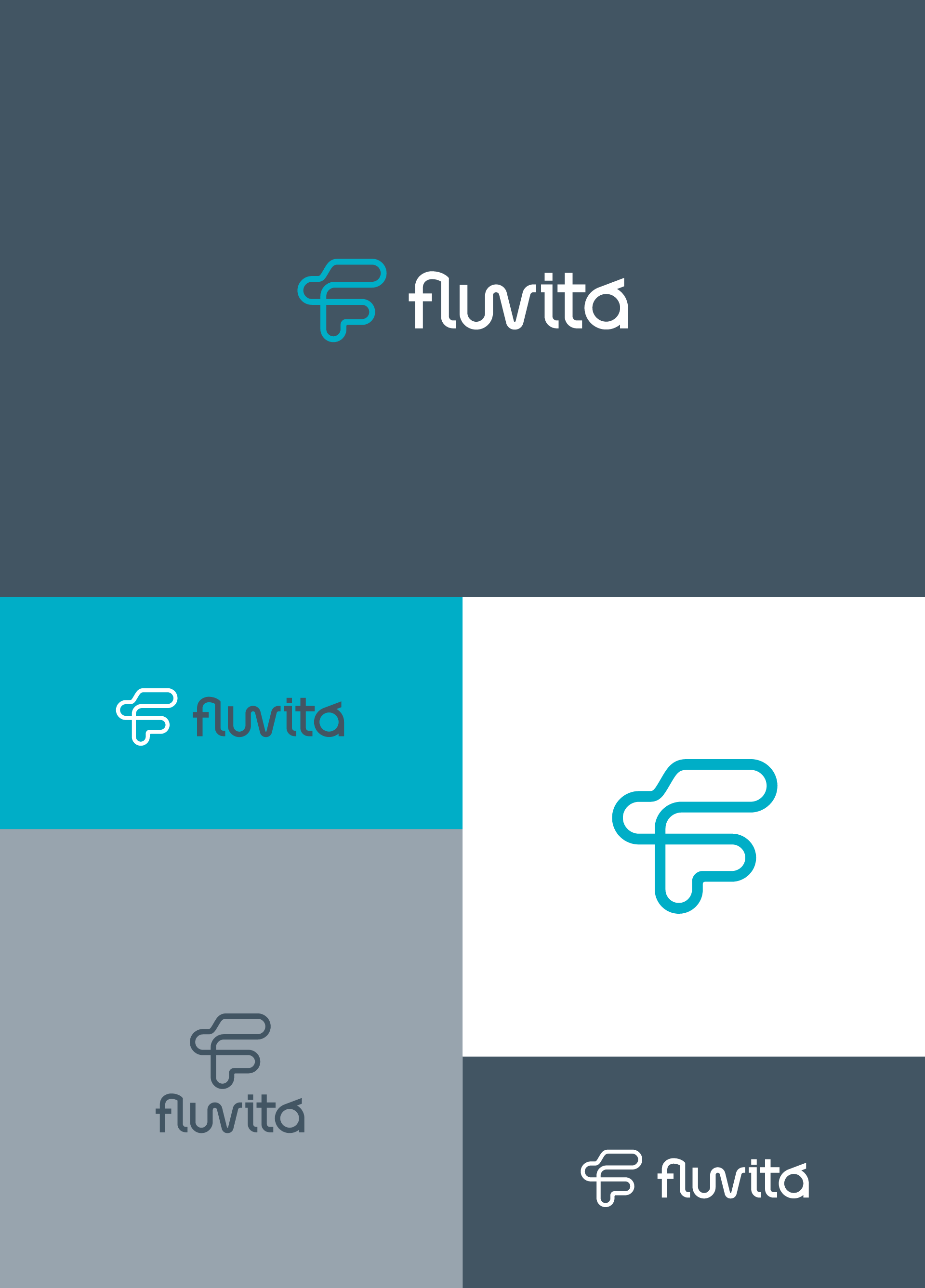
The color palette with gray and blue refers to engineering and reinforces the specialty in projects involving water. The symbol appears as graphics and in different sizes, giving the idea of flow and development. Communication is clean and corporate, resulting in a sober yet vibrant visual identity.
