
visual identity • packaging • graphic design
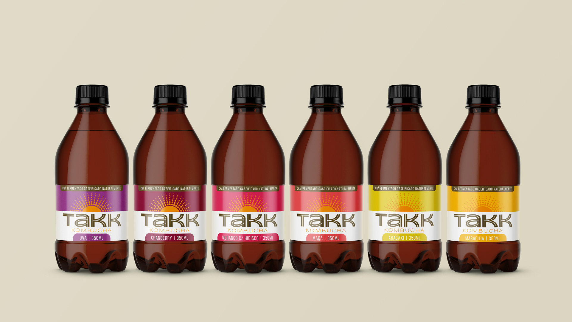
Takk is a kombucha industry based in Cascavel, in western Paraná. Takk means "thank you" in Norwegian and producing this millennial drink is the brand's way of celebrating life and showing gratitude to the universe.
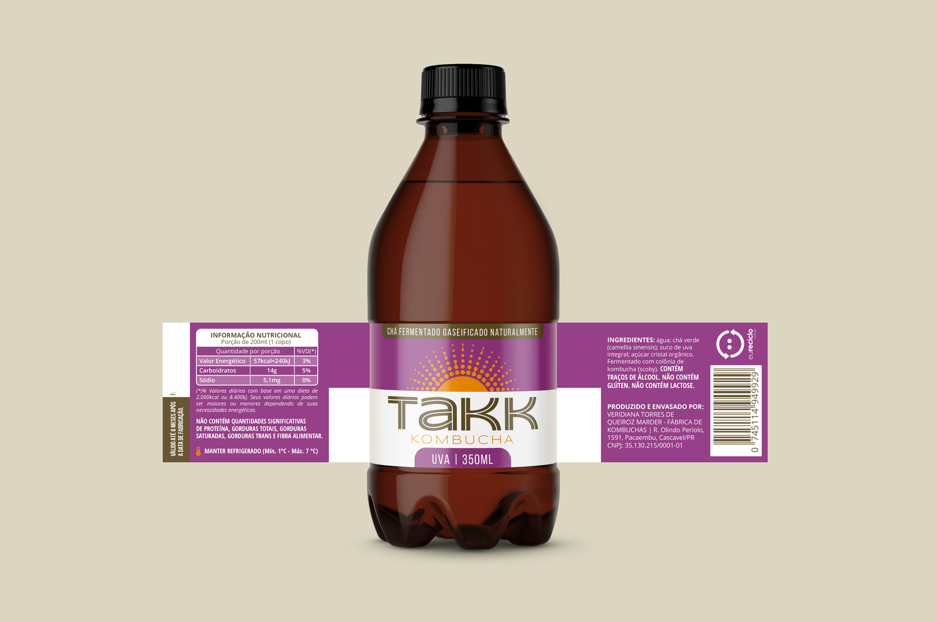
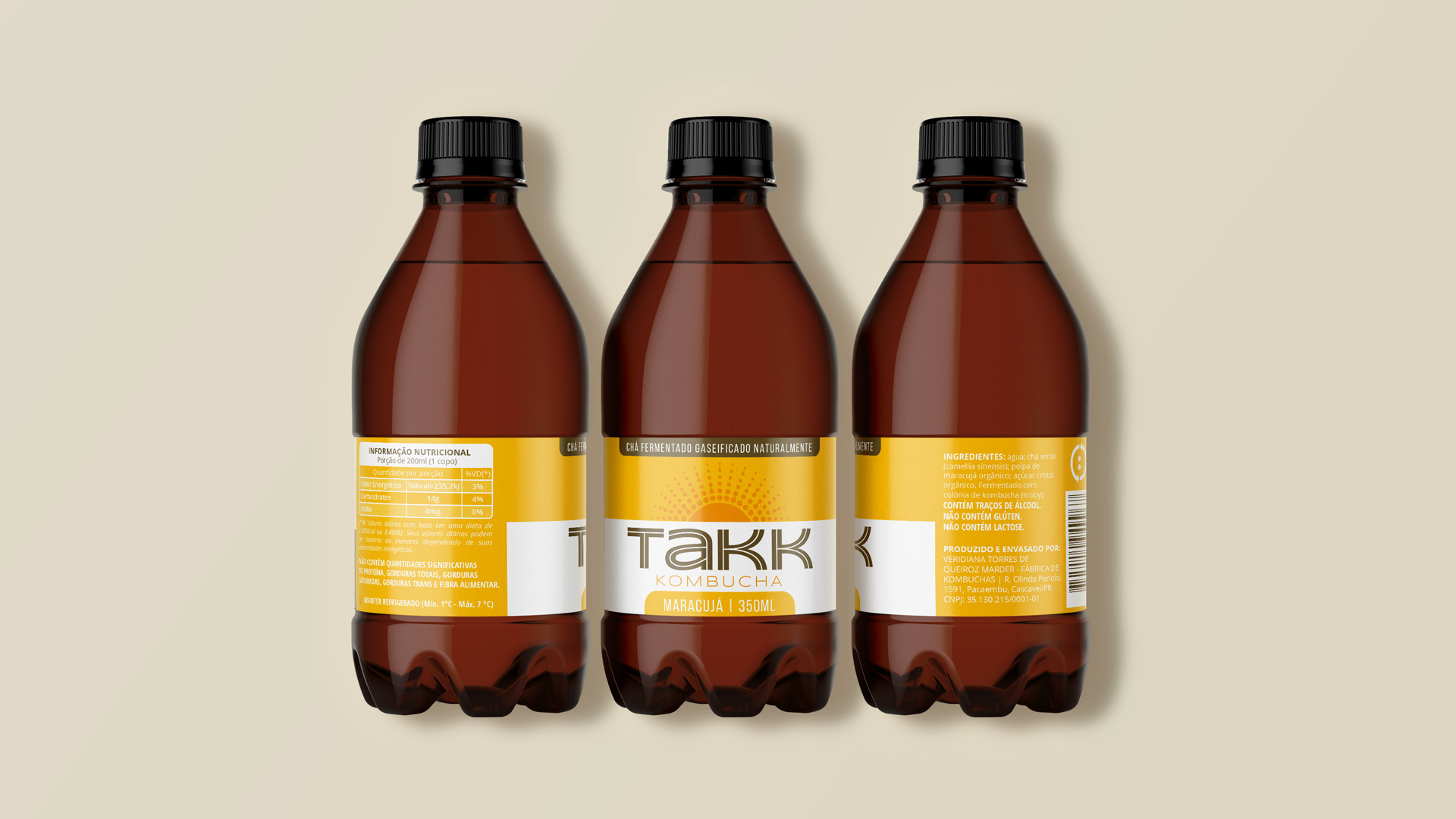
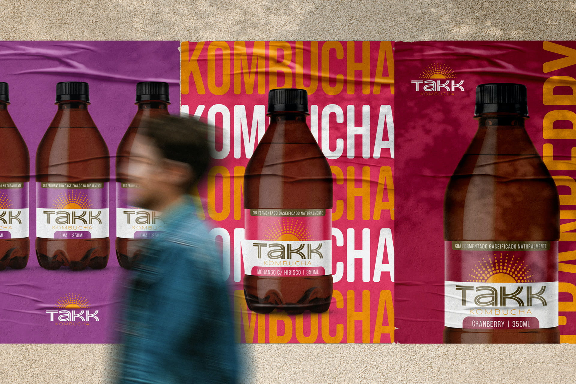
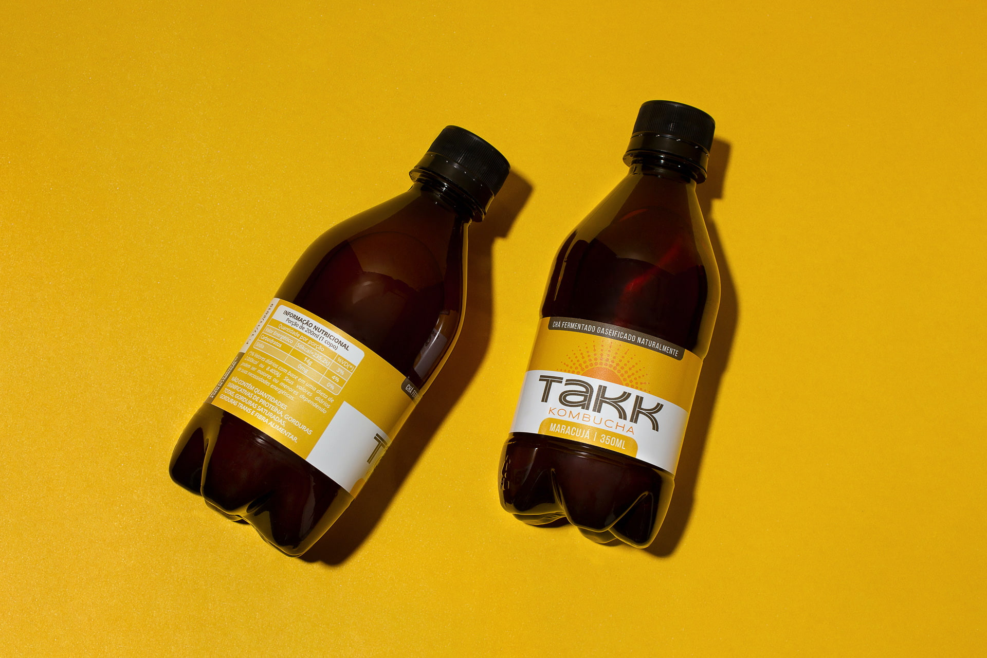
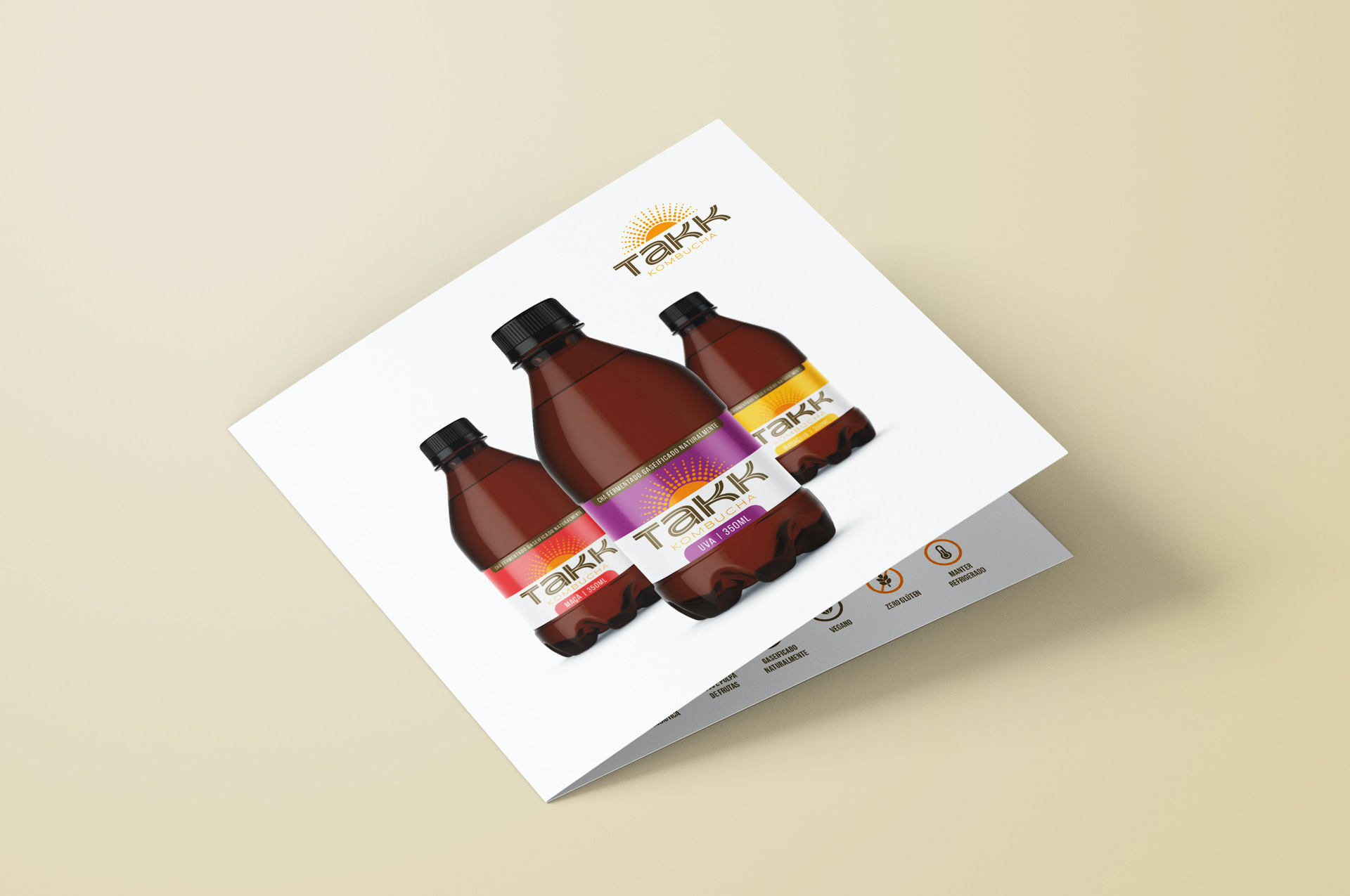
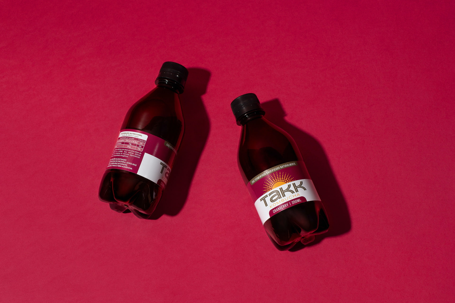
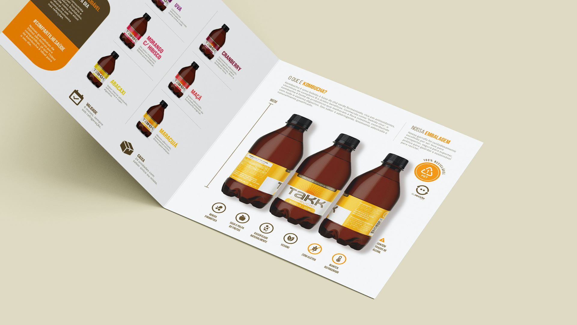
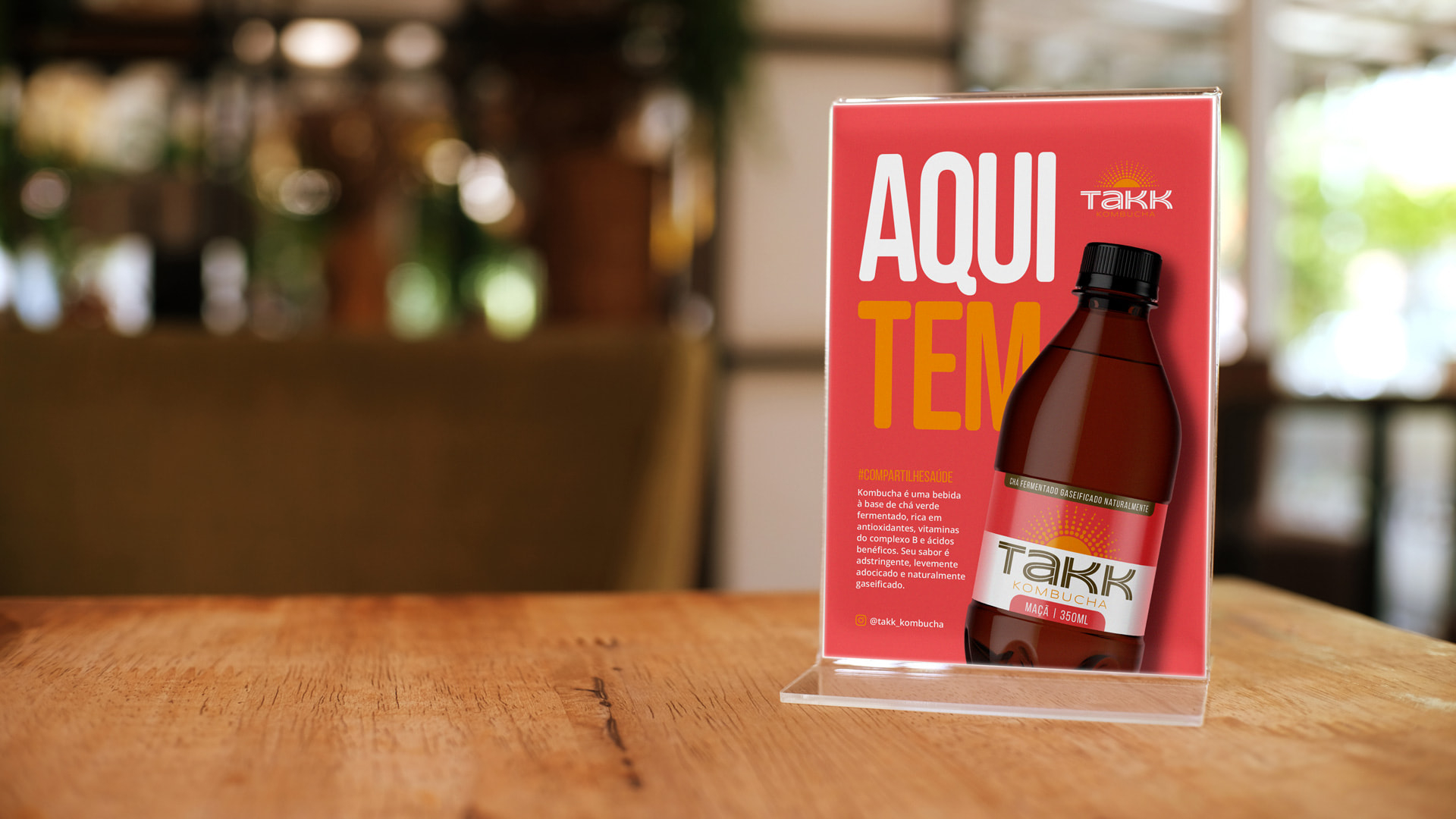
The brand symbol emerged from the combination of three elements: the Sun, representing energy and life; the gas bubbles that results of the fermentation of the product; and the colony of bacteria (scoby), an essential element for it's production. Brand communication is clean and vibrant, using warm colors in contrast to white. A product catalog, a display for the point of sale and the institutional website were also developed.


